IKEA - Layered. Bold. Tactile.
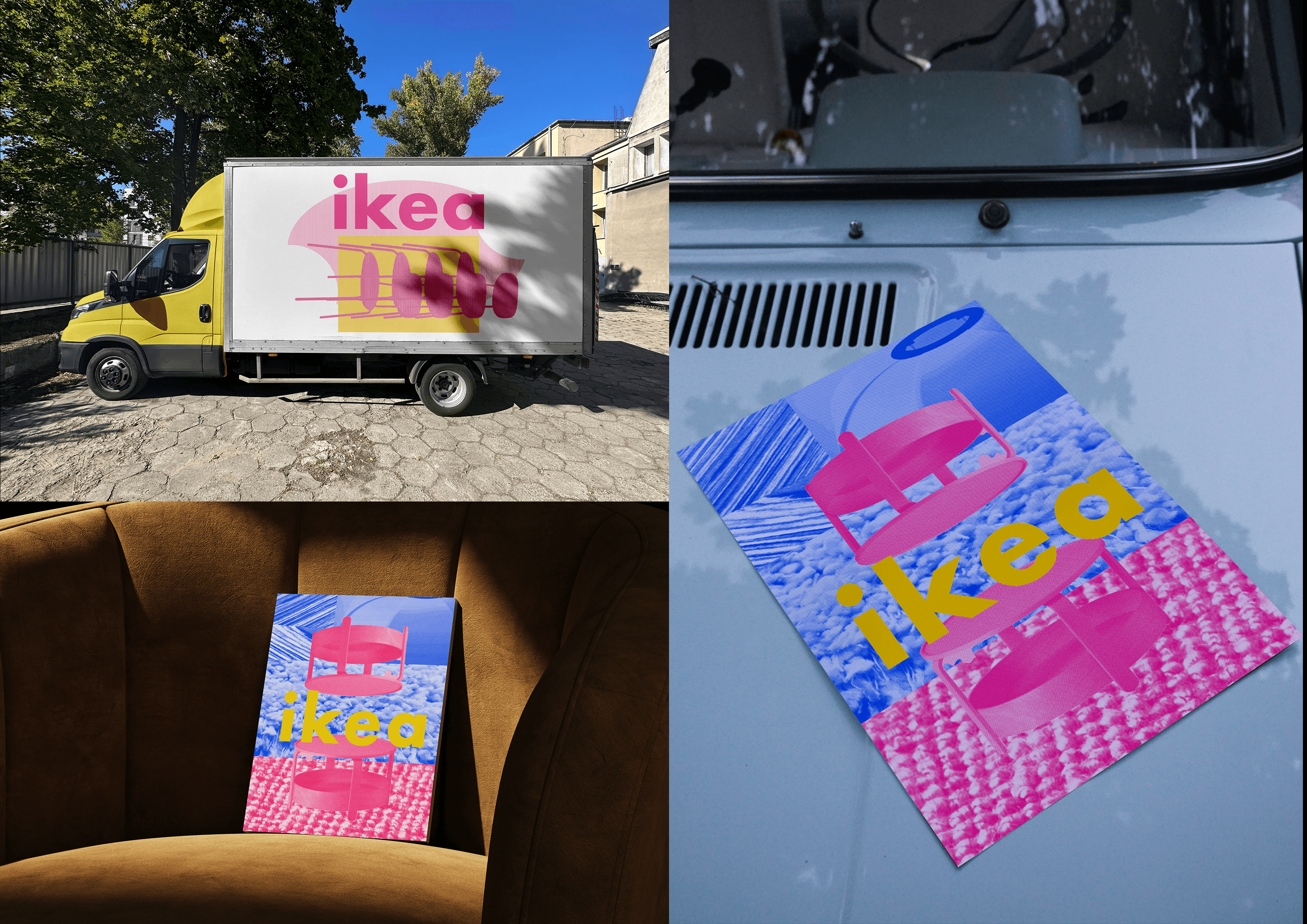
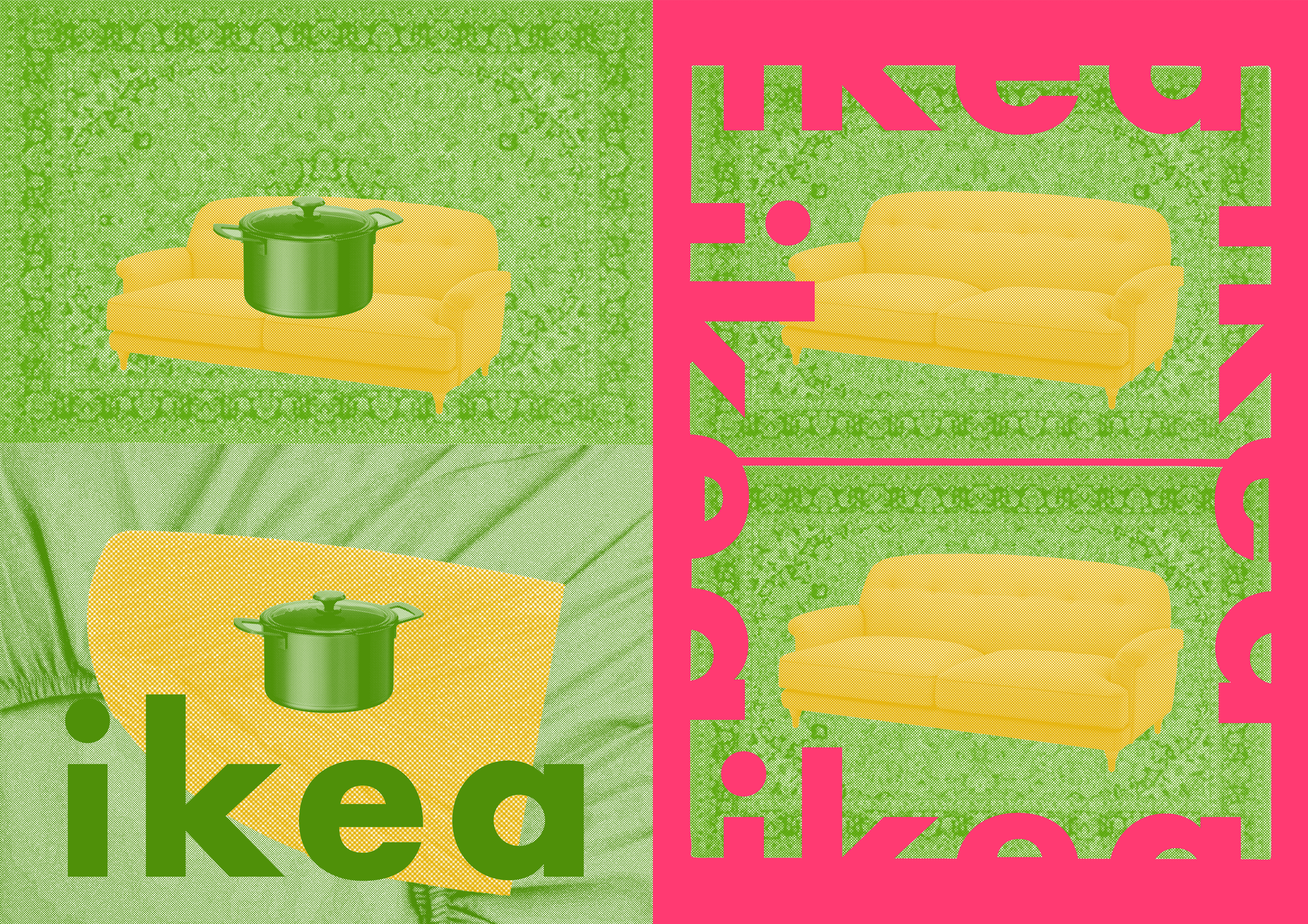
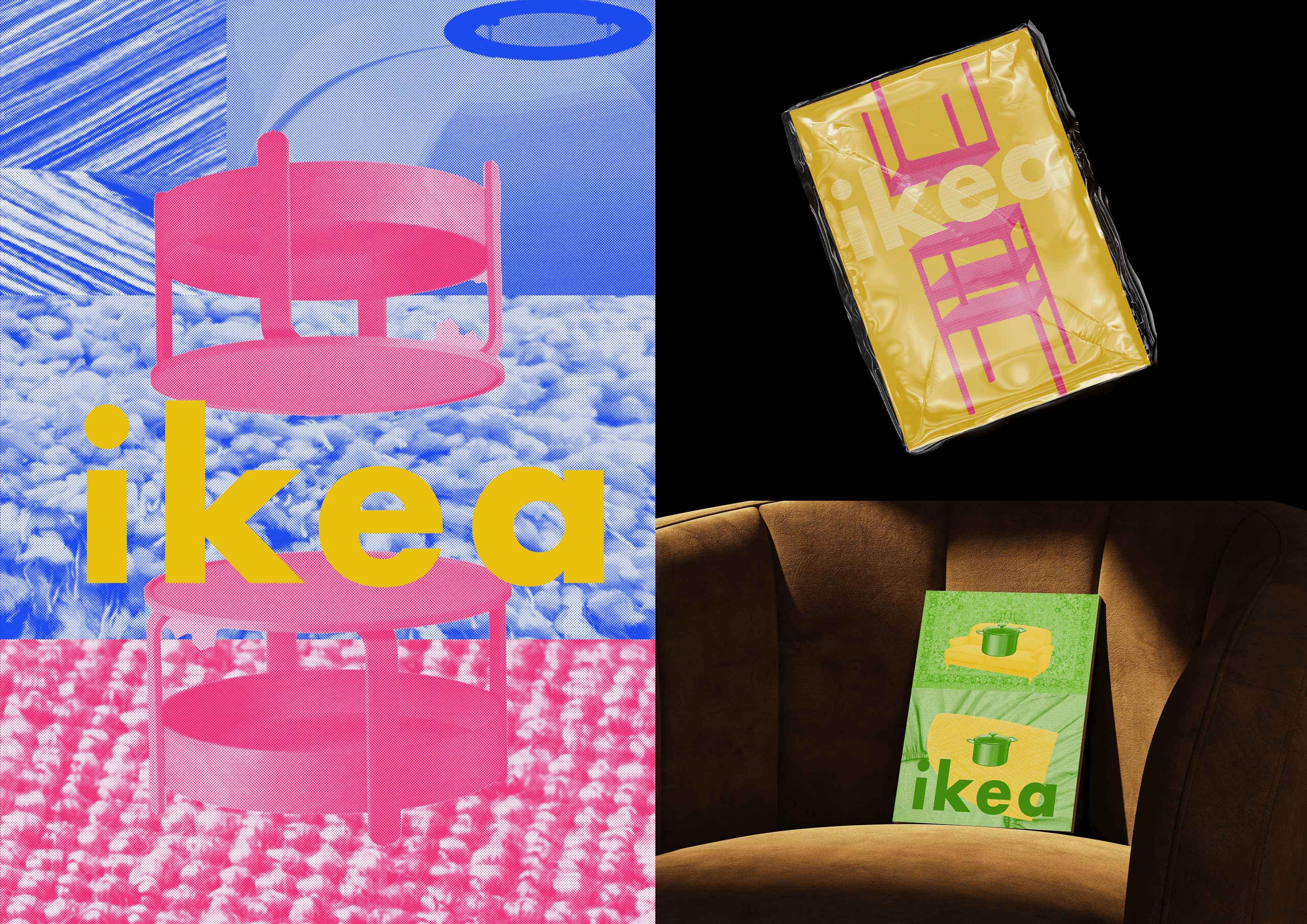
A fresh palette of pinks, blues, and yellows injects youth and energy, while subtle brand cues like a rotated small-caps IKEA logo maintain familiarity. This conceptual rebrand reimagines IKEA through a bold, layered visual language, emphasizing texture, colour, and form. Techniques like forced integration, and halftone effects turn functional products into expressive, tactile compositions.Inspired by IKEA’s modularity and materiality, elements like stacked chairs and textured surfaces convey comfort, adaptability, and innovation. The result is a design-forward, emotionally resonant system that invites users to see IKEA not just as furniture, but as tools for creative living.
A fresh palette of pinks, blues, and yellows injects youth and energy, while subtle brand cues like a rotated small-caps IKEA logo maintain familiarity. This conceptual rebrand reimagines IKEA through a bold, layered visual language, emphasizing texture, colour, and form. Techniques like forced integration, and halftone effects turn functional products into expressive, tactile compositions.Inspired by IKEA’s modularity and materiality, elements like stacked chairs and textured surfaces convey comfort, adaptability, and innovation. The result is a design-forward, emotionally resonant system that invites users to see IKEA not just as furniture, but as tools for creative living.
Project Type
Project Type
Visual Identity
Visual Identity
Year
Year
2024
2024
Role
Role
Personal project
Personal project